
Campus Art Collection : A Sense of Place
Introduction
Visual Analysis
Michael Beare
Trader
Introductory comments
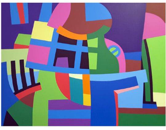
This vibrant abstract artwork is composed of a dynamic interplay of various geometric shapes, lines, and colors. The dominant visual elements are the bold, angular forms in a variety of hues including green, blue, pink, yellow, and purple.
The overall composition creates a sense of visual complexity and movement, with the shapes and lines overlapping and intersecting to form a harmonious, yet visually stimulating arrangement. The use of contrasting colors and the repetition of geometric forms help to establish a rhythmic pattern that draws the viewer's eye across the canvas.
Despite the abstract nature of the work, there is a strong sense of balance and symmetry, with the various shapes and colors organized in a way that creates a sense of visual equilibrium. The careful placement of the elements also helps to create a focal point within the composition, drawing the viewer's attention to the central area of the painting.
Overall, the work conveys a sense of energy, dynamism, and playfulness through its bold use of color, shape, and line. The artist appears to be exploring themes of balance, harmony, and visual complexity in a visually striking and engaging manner.
Michael Beare
Trader
Formal Analysis
This vibrant, abstract painting presents a visually captivating and complex composition that communicates a sense of playful energy and dynamic interplay between its various elements.
Line: The painting is characterized by bold, gestural lines that create a sense of movement and visual rhythm. These lines define the edges of the geometric shapes, while also cutting across the canvas in a more expressive, abstract manner, guiding the viewer's eye through the composition.
Shape and Form: The primary visual elements are the various geometric shapes, ranging from rectangles and triangles to more organic, curved forms. These shapes overlap and intersect, creating a sense of depth and spatial complexity within the two-dimensional surface.
Color and Hue: The color palette is highly saturated and vibrant, with a striking use of complementary hues, such as blue and orange, green and red, and purple and yellow. The bold, contrasting colors add to the overall sense of energy and dynamism, creating visual tension and emphasis.
Value and Tone: The painting features a wide range of values, from deep, saturated tones to lighter, more muted areas. This variation in value contributes to the sense of depth and three-dimensionality, while also creating areas of visual contrast and emphasis.
Texture and Surface: The painted surface appears smooth and flat, with a lack of visible brushstrokes or textural elements. This clean, polished quality allows the viewer to focus on the interplay of shapes, lines, and colors without distraction.
Space and Depth: While the composition is decidedly two-dimensional, the overlapping geometric forms and the varying scale of the shapes create a strong illusion of depth and spatial recession. The viewer's eye is drawn into the painting, exploring the complex, layered relationships between the various elements.
Design Principles:
Rhythm and Movement: The dynamic, intersecting lines and the repetition of geometric forms generate a strong sense of visual rhythm and kinetic energy, guiding the viewer's eye across the canvas.
Contrast and Variety: The sharp contrasts in color, shape, and scale create a sense of visual tension and variety, adding to the overall sense of dynamism and complexity.
Emphasis and Dominance: While the painting lacks a clear focal point, the larger, more prominent geometric shapes and the vibrant use of color draw the viewer's attention, creating a sense of visual emphasis.
Balance and Symmetry: The overall arrangement of shapes and colors, while not strictly symmetrical, creates a sense of visual balance and harmony, unifying the disparate elements into a cohesive whole.
This formal analysis highlights the ways in which the artist has utilized the essential elements of design to create a dynamic, visually striking abstract composition. The interplay of line, shape, color, and spatial relationships generates a profound sense of energy, movement, and visual complexity, inviting the viewer to engage with the work on a multifaceted level.
Michael Beare Trader visual analysis
As we delve into the visual analysis of Michael Beare's abstract painting "Trader," it's valuable to start by closely observing the artwork. Take a moment to allow your gaze to navigate the canvas, absorbing the interplay of vibrant colors, shapes, and forms. As you examine it, you might begin to notice how the various components contribute to the overall structure and emotional essence of the piece. What stands out to you first?
In terms of visual components, let’s focus on a few critical elements of art: color, shape, and space. These will provide a significant foundation for understanding the work’s impact.
The color palette is one of the most robust attributes of "Trader." The painting features an array of bold colors: lush greens, saturated blues, and fiery reds, all closely intertwined. Dominant colors like the deep green blend seamlessly with bright blue and vibrant pinks, creating a lively yet balanced atmosphere. This careful selection of color not only draws the viewer's eye but also elicits emotional responses. For instance, the greens may evoke feelings of freshness and vitality, while the red elements can stir passion or urgency. Color theory also plays a role here; for example, Beare uses complementary colors to create relationships that enhance visual appeal. When alongside oranges or yellows, these colors pulsate with energy, stimulating our senses and inviting us into a deeper investigation of the painting.
Next, let’s consider the shapes present in the composition. A mix of geometric and organic shapes populates the canvas. The straight edges and curves create a dynamic contrast, leading to an engaging arrangement. For instance, you might notice a large, rounded shape that almost resembles a head or a large object, surrounded by various rectangles and angular forms that suggest buildings or structures. This interaction between the shapes adds complexity to the artwork—do they communicate something specific, or are they merely abstract representations inviting personal interpretation? You might even ponder what meanings arise from these interactions: do they signify unity or discord within the trader’s market or life?
Moving on to the aspect of space, Beare does a remarkable job of balancing positive and negative spaces throughout "Trader." The arrangement of shapes encourages the viewer to contemplate their relationships—some elements overlap while others sit distinctly apart. This layering creates a sense of depth, almost as if the viewer could step into a three-dimensional environment. It prompts you to explore how these shapes interact in the imaginary space of the painting. As you analyze this depth, consider: how does the negative space enhance or detract from the primary forms? It could be suggested that the empty areas allow for breathability within the composition, making it more approachable and less overwhelming.
Now that we’ve touched upon some key elements, let’s transition into analyzing how these elements are organized and utilized in the artwork through principles of design. One of the most prominent principles that stands out in "Trader" is balance. Here, we can identify a form of asymmetrical balance. Although the shapes are diverse and varied, the distribution of colors and forms across the canvas achieves equilibrium. This lack of symmetry creates an intriguing sense of tension, which captures the viewer’s attention. Through this balance, Beare manages to maintain visual harmony while exhibiting a sense of playfulness. Ask yourself, does the asymmetry contribute to a feeling of dynamic movement, or does it foster a sense of chaos?
Harmony is another principle worth noting in the analysis of this painting. Many of the colors and shapes repeat throughout the composition, providing a sense of unity. For instance, similar shades of green and blue are scattered across different forms, connecting them in a way that feels cohesive. This use of repetitive elements also fosters a kind of rhythm, guiding our eyes across the canvas. The visual flow encourages a deeper engagement with the piece, prompting viewers to explore various paths without feeling lost.
Let’s not overlook the principle of emphasis, which plays a vital role in directing the viewer’s focus. In "Trader," you might find that certain shapes or colors draw attention more than others. The overlapping rounded forms are particularly compelling; they draw you in, inviting contemplation and curiosity. What is the significance of these emphasized shapes? Are they traditional representations of trading, or do they symbolize something deeper about the human experience? The way Beare has chosen to highlight these elements contributes to a layered understanding of the work.
Finally, let’s integrate these elements and principles of design to encompass the overall impact of "Trader." The interplay of vibrant colors with contrasting shapes and balanced spaces creates a rich tapestry that resonates emotionally with the viewer. Beare clearly intends to provoke thought and dialogue, inviting us to consider interpretations beyond merely what we see. The painting becomes a medium for personal reflection, as it prompts questions about our relationships with commerce, life, and one another.
As we conclude our visual analysis, think about how "Trader" encapsulates the essence of abstract art. The thoughtful combination of color, shape, and space, along with the effective application of design principles, enriches both the artist's intent and the viewer's experience. What resonates most with you about this artwork, and how does it challenge your perceptions of abstract art?
Ultimately, "Trader" serves as an invitation to explore the dialogue between visual elements and emotional resonance. Beare’s use of vibrant colors stimulates our senses, while the interplay of shapes and spaces creates a layered complexity that beckons deeper contemplation. The asymmetrical balance invites wonder rather than discomfort, allowing viewers to engage with the artwork without feeling overwhelmed. This engagement can lead to diverse interpretations, each as valid as the last, making "Trader" a compelling study in the nature of abstraction.
Viewing this painting, you might find yourself not only contemplating its aesthetic qualities but also reflecting on your own experiences—your thoughts about trade, commerce, and how these concepts are woven into the fabric of daily life. Beare’s work challenges us to think critically about our environment and our relationships. It emphasizes that even in abstraction, there lies the potential for narrative, emotional depth, and connection. So, I encourage you to ponder: what stories does "Trader" tell you? How might your individual perspectives shape your understanding of this vibrant, complex piece?
Through our exploration of its elements and principles, we’ve seen how "Trader" encapsulates the transformative power of abstract art—serving not just as a visual experience, but as a catalyst for thought, emotion, and dialogue.