Campus Art Collection : A Sense of Place
Introduction
Visual Analysis
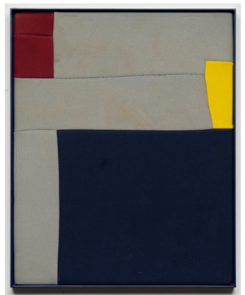
Henry Jock Walker
Pier and Ocean (After Mondrian and Ripcurl Thermalite) Introduction
Take a moment to look closely at this intriguing work of art titled “Pier and Ocean (After Mondrian and Ripcurl Thermalite)” by artist Henry Jock Walker. At first glance, you're greeted by a striking geometric composition with a narrow frame that contains a collection of colored shapes and textured surfaces. The piece features blocks of color, predominantly deep blue and soft beige, interlaced with bold accents of red and yellow. You might notice how the smooth lines and uniform shapes create a sense of order and balance, reminiscent of the works of Piet Mondrian, who is known for his distinct use of color and geometry. The rectangular forms are arranged in a way that implies a horizon, evoking the vastness of both a pier extending into the sea and the ocean itself. Each element has its significance, layered carefully to create a narrative that invites viewers to dive deeper.
As you observe this artwork, many people may find themselves experiencing a range of emotions. Perhaps you feel a sense of calmness, as colors often have the ability to evoke serenity and stability. The deep blue can echo the tranquility of ocean water, while the lighter shades of beige might remind you of sandy shores. Conversely, the bright red and yellow could elicit excitement or evoke the sun’s warmth breaking through clouds. This interplay of colors and feelings intrigues viewers as they consider what the work conveys about the natural world and their own connection to it. Have you ever felt a mix of emotions when encountering nature? How does this artwork manage to reflect those feelings through its use of color and form?
Engaging with this piece invites us to consider our own interpretations and experiences with art. What does the combination of neoprene—a material commonly used in wetsuits—signify to you? Many viewers might find it fascinating that this artwork is not just about visual aesthetics but also about materials that carry a history and utility. The use of neoprene brings forth questions about our interaction with the ocean and our dependency on technology to explore its depths. Shouldn't we think about how our relationships with nature are often intertwined with innovation? As you stand before this piece, ask yourself: What narratives can you draw from the juxtaposition of color and form? In what ways does this artwork resonate with your own encounters by the ocean or experiences in the water?
As we delve deeper, you might see how “Pier and Ocean” challenges conventional boundaries by integrating everyday materials into fine art. The application of wetsuit material is not just innovative; it evokes broader discussions about environmentalism, resource utilization, and the tension between nature and technology. By employing a material typically associated with sports and recreation, Walker creates an artwork that comments on contemporary life and our interaction with the environment. Could it be that this piece serves as a metaphor for the ongoing conversation about sustainability, encouraging viewers to think twice about how they engage with both art and nature?
The artwork stands as a window into the themes of abstraction and environmental consciousness, inviting dialogue about how we perceive our world. On a larger scale, this connection between form, color, and material encapsulates the concerns of modern life and our ever-shifting relationship with nature. As you reflect on “Pier and Ocean,” consider how such artworks provoke thought and awareness about larger societal issues. Does engaging with this piece lead you to confront your notions of nature, art, and their intersection in our lives?
In conclusion, Henry Jock Walker’s “Pier and Ocean” is not merely a visual representation of a scene; it invites us into a dialogue that stretches from personal reflections to societal implications. The mixture of color, shape, and material creates a rich tapestry of ideas that can provoke thought and inspire conversations. So, as you think about the depths of meaning behind this artwork, challenge yourself with this final thought: What stories are waiting to be uncovered in the layers of art, nature, and our intertwined experiences?
Henry Jock Walker
Pier and Ocean (After Mondrian and Ripcurl Thermalite) visual analysis
As we delve into the visual analysis of Henry Jock Walker’s artwork, “Pier and Ocean (After Mondrian and Ripcurl Thermalite),” let’s begin by closely examining the visual components of the piece. At first glance, the artwork presents a tightly framed composition filled with geometric shapes in a precision-driven arrangement. This piece consists predominantly of colorful blocks, primarily deep blue, neutral beige, and bold accents of red and yellow. Each of these components carries weight, contributing to the overall narrative and evoking specific feelings.
Now, let’s identify some key elements of art that stand out. One notable element is color. Walker employs a carefully curated palette that prompts the viewer's emotional response. The deep blue, for example, can evoke feelings of tranquility and vastness, reminiscent of the ocean itself. In contrast, the vibrant yellow and red draw your attention, injecting energy and warmth into the piece. This interplay between calm and vibrancy is significant, as it captures the essence of a seaside experience—where serenity meets excitement. Have you ever felt that mix of tranquility and exhilaration when standing on a pier overlooking the ocean? Can you appreciate how Walker’s choice of colors might mirror that sensation?
Next, let’s explore the aspect of shape. The artwork prominently features geometric shapes—rectangles and squares—that are meticulously arranged. The use of shapes is not merely aesthetic; it facilitates a structural harmony within the composition. The large blue block occupies the lower section, providing a stable base, while the smaller shapes in the upper portion create a sense of movement and ascent. This arrangement could be interpreted as a metaphor for the horizon line, signaling the connection between land and sea. In a world where so much is fluid and dynamic, how do you feel about the stability these shapes provide?
Moving on to texture, Walker’s choice of neoprene adds another layer of interest to the piece. Often associated with wetsuits and aquatic activities, the material has a unique surface quality that contrasts with traditional canvas or paint. The smoothness of the neoprene not only enhances the visual appeal but also invites tactile curiosity. You might wonder how this material choice influences your experience of the artwork. Does it make you think differently about the relationship between art and the mediums we typically associate with it?
Now that we have explored these elements, let’s shift our focus to the principles of design. Balance is an essential aspect that Walker achieves through asymmetrical arrangement. While the composition is not uniform from side to side, it creates a visual equilibrium that is both dynamic and pleasing to the eye. The size and positioning of the colored blocks allow them to complement one another rather than compete for attention. This balance enables the viewer’s eye to glide effortlessly across the piece, much like the gentle waves of an ocean. How does this balance make you feel while viewing the artwork?
In harmony with balance, the principle of emphasis plays a critical role in guiding the viewer’s attention. The bold red and yellow shapes are strategically placed to create focal points that draw you in. While the deep blue block serves as a grounding force, the brighter shapes help to shift your gaze and generate interest. By using color strategically, Walker emphasizes these areas while allowing the background elements to recede. This invites further exploration, encouraging you to examine the subtleties of the artwork. What do you think these points of emphasis convey about the artist’s message?
Next, let’s consider the movement created through the arrangement of elements. The way shapes are aligned leads your eye in a natural flow around the composition. You might notice that the placement of the smaller blocks draws you upward, suggesting a journey or exploration. This sense of movement imbues the piece with a kinetic quality, reminiscent of waves gently lapping against a shore. As your eyes traverse the various shapes, do you feel as though you’re engaging in a dialogue with the artwork?
In discussing these visual components and design principles, we start to see how they interact to convey deeper meaning. The combination of color, shape, texture, balance, emphasis, and movement creates a piece that resonates on multiple levels. Walker cleverly integrates his materials—the neoprene—not merely for novelty but to enhance the thematic connection to the ocean, inviting a conversation about human interaction with nature.
In conclusion, the overall impact of “Pier and Ocean” becomes clearer through this detailed visual analysis. It’s a work that invites you to reflect on personal experiences as well as broader themes of environment and technology. Walker’s compositions extend beyond their visually arresting aesthetics; they spark dialogue and contemplation about our place within the natural world. As you take in the artwork, consider how Walker’s choices invite you to ponder questions of balance, interaction, and meaning. What does this artwork ultimately reveal to you about your relationship with the ocean, the environment, and the art of innovation?