
Campus Art Collection : A Sense of Place
Introduction
Visual Analysis
Erin Lau Reconfigurations introduction
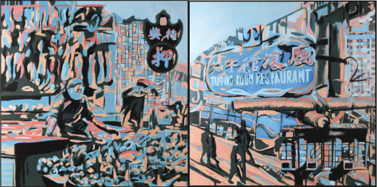
As we explore Erin Lau’s captivating diptych, “Reconfigurations,” we're immediately drawn into a vivid interplay of colors, shapes, and symbols that narrate a unique story across its two panels. The artwork employs a striking palette of bold blues and soft pinks, creating a dreamlike atmosphere that invites us to linger. On the left, we see a bustling street stall, likely selling fresh fruit, where a vendor leans over the vibrant display. Above the stand, numerous objects dangle, contributing to the market's lively ambiance. A prominent sign advertising a pawn shop casts a layered meaning over this scene, implying not only a place of commerce but also an intersection of stories and exchanges that await.
Looking to the right panel, we are greeted by a large, illuminated sign for Tai Ping Koon restaurant, a staple in the culinary landscape of Hong Kong. It appears to be supported by bamboo scaffolding—an iconic feature in the city's architecture and construction, reflecting not only practicality but also cultural significance. The silhouettes of two to three figures move along the street, their dark forms contrasting against the lighter backdrop, suggesting lives intertwined in the narrative of this urban space. There is a palpable division between the vibrancy of the market and the more subdued essence of the restaurant scene, inviting viewers to contemplate the different energies that these environments evoke.
Many viewers often experience a range of emotions when encountering this diptych. The left panel, with its lively street stall, might evoke feelings of warmth and community, inviting reflections on daily interactions and shared spaces. Conversely, the right panel may elicit a sense of introspection and solitude amidst the bustling life, as the restaurant sign looms large, perhaps symbolizing the comfort of familiar places amid the chaos of urban existence. How does this juxtaposition between the lively market and the solitary restaurant affect your own perception of city life?
Engaging with “Reconfigurations” prompts us to consider our personal connections to these scenes. The artwork nudges us to reflect on our own experiences in markets and restaurants—perhaps memories of navigating crowded stalls or the comforting routine of visiting a favorite eatery. As we examine the details—the bamboo scaffolding, the pawn shop sign, the assortment of fruits—are we reminded of the narratives that lie beneath these everyday encounters? This kind of reflection encourages a deeper engagement with both the artwork and our own lives, allowing us to draw parallels between Lau's representation and our own experiences in similar environments.
Through Lau's “Reconfigurations,” we find a powerful commentary on cultural identity and the complexities of urban existence. The two panels tell a larger story about community connections and the dynamics of survival in a bustling city. The figures present, though silhouetted, evoke the myriad of lives that intersect in the vibrant settings of markets and restaurants, each contributing to a larger narrative of urban life. This interplay of presence and absence compels us to consider how these spaces reflect our own identities and experiences in the context of a constantly evolving city landscape.
Ultimately, as we immerse ourselves in the world of “Reconfigurations,” we begin to see art as a crucial dialogue tool. It invites us to explore themes of migration, community, and the ephemeral nature of daily life. Lau’s work does not just depict a moment; it encourages us to ponder the larger implications of our surroundings while reminding us that every stall, every sign, and every silhouette tells a story worth investigating. As you step back from this artwork, consider this: How does your own narrative intertwine with those portrayed in “Reconfigurations,” and what stories do you carry with you as you navigate your own urban experience?
Erin Lau Reconfigurations visual analysis
As we explore Erin Lau’s diptych, “Reconfigurations,” a vivid tapestry of colors, lines, and forms unfolds before us. This artwork is rich with visual components that invite careful observation and thoughtful analysis. The two panels—one depicting a bustling street stall and the other showcasing the iconic Tai Ping Koon restaurant—each present a unique artistic language that prompts us to consider various elements of art and the principles of design that shape our experience of the piece.
Let’s start by examining the most striking visual component of this artwork: color. Lau employs a bold color palette that predominantly features deep blues and soft pinks. These colors create an evocative contrast that not only catches the eye but also elicits an emotional response. For instance, the vibrant blue tones suggest both calm and depth, perhaps representing the complexity of urban life, while the gentle pinks offer warmth and a sense of familiarity. Together, they create an almost dreamlike quality that permeates both panels. Have you ever noticed how color can dramatically influence your feelings about an artwork? In “Reconfigurations,” the colors work in harmony to bridge the two scenes while still maintaining their individual identities.
Next, let’s consider the use of line in the diptych. Lau uses both straight and curved lines to guide the viewer’s gaze through the artwork. The strong vertical lines of the bamboo scaffolding in the right panel create a structured backdrop that holds the Tai Ping Koon sign prominently, while the curved edges of the fruit stall in the left panel introduce an organic flow. This juxtaposition guides our eyes from left to right, emphasizing the transition from the lively atmosphere of the market to the reassuring presence of the restaurant. It’s as if Lau uses lines not merely for outline but as pathways to take us through the narrative of her work. How might the experience differ for you if the lines were more chaotic or less defined?
Moving on to the principle of balance, we see a fascinating combination of asymmetry in the diptych. The left panel, bustling with figures and fruit, carries a weighty vibrancy, while the right panel, with its silhouettes and large sign, feels more anchored and still. This balance enhances the overall composition, creating a dialogue between the panels without one overpowering the other. Asymmetrical balance can create tension and energy, allowing viewers to engage dynamically with the piece. This thoughtful arrangement makes us aware of the contrasting energies present in daily urban life—energy that can coexist, reflecting the real-world interactions we experience in cities.
The principle of emphasis is also central to understanding Lau's intent. The focal point in the left panel is undoubtedly the fruit and the vendor, drawing attention through not only the vibrant colors but also the multitude of shapes and textures. In contrast, the right panel emphasizes the prominent restaurant sign. The size and clarity of the sign dominate, inviting viewers to ponder the significance it holds in this urban landscape. This duality in focus allows us to contemplate the stories behind these everyday scenes. What happens in this moment between the vendor and the diners? By isolating these moments of emphasis, Lau enables us to engage deeply with her artwork while inspiring curiosity about the narratives unfolding within.
Finally, let’s consider how space and texture contribute to the artwork's overall impact. The arrangement of both positive and negative space in Lau's diptych creates a sense of depth that engages the viewer further. In the left panel, the busy stall with fruits and hanging objects occupies the space vibrantly, while the backdrop offers a more subdued negative space that allows the vendor and shoppers to take center stage. In contrast, the right panel has a more straightforward composition, where the bamboo scaffolding frames the restaurant sign, providing a clear delineation of space. This interplay creates a sense of visual relief, allowing viewers to process the information presented without feeling overwhelmed.
The textures in this painting also empower its storytelling. The smooth, flat colors contrast with the implied texture of the fruits and the roughness of the bamboo scaffolding. This contrast not only enriches the visual experience but also deepens the narrative; we can almost feel the differences between the vibrant life of a market and the calmer, structured existence of an urban eatery.
In synthesizing these elements of art and principles of design, we see how Lau’s “Reconfigurations” serves as more than just a visual experience; it becomes an exploration of identity and culture in a bustling environment. The effective use of color, line, and balance, combined with the careful consideration of space and texture, all work in concert to evoke a multifaceted dialogue about daily life in urban settings.
In conclusion, “Reconfigurations” stands as a powerful commentary on the complexities of city living. Through a masterful arrangement of visual elements and principles, Erin Lau invites viewers into a space of contemplation and engagement, pushing us to consider not only the scenes depicted but also our own experiences within urban landscapes. As you think back on this artwork, consider this final thought: how do your interactions within your own cityscape echo the stories illustrated in “Reconfigurations”?