
Campus Art Collection : A Sense of Place
Introduction
Visual Analysis
Enoch Ho A Sense of Place 2 Introduction
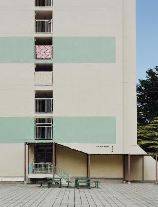
As we stand before Enoch Ho's thought-provoking piece titled "A Sense of Place 2," let's take a moment to absorb its visual elements. The image captures a building situated in a public housing estate in Hong Kong, showcasing a minimalist aesthetic defined by its muted color palette. The walls are painted in a soft beige, adorned with horizontal teal stripes that provide a subtle contrast. What we see here are not traditional windows, but rather the ends of the landings on each floor, framed by protective railings that suggest a practical, utilitarian design. Hanging over these railings are colorful bed linens, draped with casual ease, infusing the structure with life and vibrancy.
As viewers engage with this scene, many find themselves grappling with complex emotions. Some may experience nostalgia, reminiscent of their own experiences within urban communities, while others may sense a feeling of isolation, prompted by the stark architecture juxtaposed with the personal touches of home life. This duality challenges observers to consider their emotional connections to such settings. Have you ever lived in a space where personal touches stood out against a backdrop of uniformity? How does this blend of the mundane and the vibrant affect your perception of home?
Encouraging deeper engagement with the artwork invites us to reflect on our own experiences. The bed linens hanging from the railings serve as subtle narratives of individual lives within the collective environment of public housing. Each piece carries the stories, routines, and identities of the residents, transforming the otherwise austere setting into a tapestry of daily life. What do these colorful linens reveal about the individuals who spend their lives within these walls? As onlookers, we are prompted to consider our own homes and the narratives they tell. How does the interplay of personal expression and communal living shape our understanding of identity in urban settings?
As we explore broader implications, Ho's work encapsulates vital themes surrounding belonging, identity, and the nature of modern urban life. By showcasing this essential yet often overlooked public housing structure in Hong Kong, the artwork challenges us to confront our assumptions about what constitutes home. How often do we overlook the rich histories and diverse experiences woven into our surroundings? The seemingly lifeless façade gives way to intimate glimpses of domesticity, urging viewers to find connection and meaning within the fabric of community life.
Ultimately, "A Sense of Place 2" serves as a powerful reminder that every building, every community, and every individual holds a story waiting to be discovered. This artwork compels us to critically reflect on our perceptions and interactions with the environments we inhabit. As we take a step back from this piece, consider this final question: how might recognizing the layered lives within a simple public housing estate inspire us to foster deeper connections in our own communities and reevaluate our notions of belonging?
Enoch Ho A Sense of Place 2 visual analysis
As we delve into Enoch Ho's compelling work titled "A Sense of Place 2," let's take a closer look at the visual components that contribute to the piece's overall impact. This artwork offers a striking depiction of a public housing estate in Hong Kong, and by carefully analyzing its elements and design principles, we can gain a deeper understanding of its significance.
Starting with our observation, the first thing that strikes the viewer is the building's minimalist aesthetic. The use of a muted beige color serves as the foundation of the composition, while horizontal teal stripes add a subtle contrast. The image features multiple landings visible from a staircase, which intricately frame the scene with their clean lines. Notice how the bed linens hanging from the railings not only introduce splashes of color but also break the visual monotony of the structure. The combination of these components creates a tension between the starkness of the building and the warmth of home life, encouraging us to engage with what we see on a personal level.
When we analyze the elements of art used in this piece, color emerges as a particularly impactful component. The predominant beige and teal palette creates a sense of calmness and stability, reflecting the utilitarian nature of public housing. However, the colorful bed linens introduce a contrasting vibrancy that injects life into this otherwise functional space. This contrast evokes complex emotions in the viewer: the sterile exterior may initially suggest a lack of warmth or individuality, while the bed linens assert a personal connection, hinting at the lives and stories of the residents. This interplay of colors challenges us to reconsider our perceptions of urban environments—how can stark architecture coexist with the vibrancy of personal expression?
Turning our attention to line, we observe the strong, straight lines that characterize the building's framework and the railings surrounding each landing. These lines guide the viewer's eye across the composition, leading us from one element to another. The straight edges evoke a sense of order and stability, qualities often associated with public housing. However, the slightly disorganized placement of the colorful linens creates a visual tension that disrupts this sense of order. One might ask: how does this tension contribute to our understanding of life in a public housing estate? Does it reflect the complexity of human existence within structured environments?
Next, let's examine texture. The artwork gives a sense of solidity and firmness, yet the contrasting softness of the bed linens introduces a tactile quality that invites the viewer to imagine the sensation of these materials. This juxtaposition enhances the emotional depth of the piece. The smooth, matte texture of the building’s surface stands in stark contrast to the more varied textures of the linens, which appear inviting and familiar. By highlighting this contrast, Ho perhaps invites us to reflect on the often-overlooked aspects of life within public housing—qualities that evoke warmth, comfort, and individual identity amidst the starkness of communal living.
Now, let's move into the principles of design as they relate to Ho's artwork. One notable principle present in this composition is balance. The artwork exhibits asymmetrical balance, achieved through the strategic placement of colors and forms. The patches of color created by the linens disrupt the otherwise uniform façade. This deliberate imbalance generates visual interest and evokes feelings of dynamism and movement. The viewer might thus feel drawn to examine the colorful linens more closely, inviting deeper engagement with the narrative they suggest. Would a more symmetrical arrangement have evoked different emotions? It’s intriguing to consider how asymmetry can enhance a viewer’s experience.
Moreover, the principle of contrast plays a critical role in this piece. The stark beige walls stand in sharp contrast to the vibrant bed linens, capturing the viewer's attention and creating a sense of visual intrigue. This contrast not only adds interest but also serves to highlight the separation between the utilitarian aspects of public housing and the personal lives of its inhabitants. This juxtaposition invites us to reflect on the human stories that permeate these spaces. What stories lie behind the colorful linens? How do they illuminate the lives of those living within the building?
As we synthesize our observations, it becomes clear that the harmonious interaction between the elements of art and the principles of design allows Ho's work to communicate a deeper message. The use of color, line, and texture creates an emotional resonance that speaks to the complexity of urban life. The colorful linens become symbols of individuality and connection in an environment that may, at first glance, appear stark and impersonal. We are left with an impression that life within public housing is not merely functional but also vibrant and rich with stories.
In conclusion, "A Sense of Place 2" generates an impactful dialogue surrounding identity, belonging, and the human experience within urban settings. Through careful use of color, line, texture, and design principles such as balance and contrast, Enoch Ho crafts an artwork that invites viewers to reflect on their perceptions of public housing and the layers of life hidden within its walls. As we step back from this analysis, consider this question: how can recognizing the complexity of individual lives in seemingly impersonal settings lead us to a greater understanding of community and connection in our own lives